Types of Data: Are They Important?
Soman A.
9/17/20254 min read


You’ve built what looks like a perfect analysis. Clean charts. Clear numbers. Then your manager asks:
“Why did you calculate the average of those ratings?”
You freeze. You’re not actually sure if that even makes sense. This happens because most people jump straight to analysis without asking the most fundamental question: What type of data am I working with?
Understanding data types determines which analyses work, which visualizations tell the truth, and which statistical tests give valid answers. Get this wrong, and everything crumbles.
In this blog, you'll learn the four main types of data, how to identify them in real datasets, and the critical mistakes that trip up even experienced analysts.
What Are Data Types in Statistics?
Data types are categories that describe the nature of your information. They're the DNA of your variables—they determine what mathematical operations make sense and which analytical techniques will work.
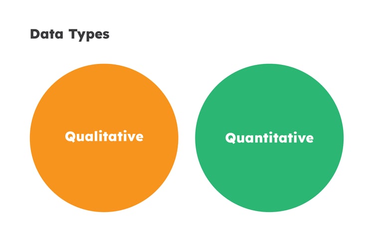
Here's the simplest breakdown: some data represents qualities (categories like "red" or "satisfied"), while other data represents quantities (numbers like "27 customers" or "5.8 seconds"). This fundamental split—qualitative versus quantitative—shapes everything else.
Why does this matter?
Because applying the wrong analysis produces nonsense. Early in my career, I calculated average customer satisfaction scores and reported that satisfaction improved from 3.2 to 3.7.
My client asked, "What does 3.2 mean?" I couldn't answer. The ratings were ordered categories, not true measurements. I'd treated ordinal data like interval data, producing a meaningless number.
Qualitative Data
It describes qualities that can't be measured numerically.


Examples:
Customer regions (North, South, East, West), product categories (Electronics, Clothing, Home), transaction status (Completed, Failed, Pending).
You can't perform arithmetic. Calculating the "average region" makes no sense. What you can do is count frequencies, identify the most common category, and analyze relationships between categories.
It answers "what type?" or "which category?"
Limitation:
Quantitative Data
It represents amounts expressed as numbers.


Examples:
47 customers, $2,847 revenue, 3.2 seconds load time, 98.6°F temperature.
You can calculate means, standard deviations, correlations, and run regression models. Quantitative data unlocks the full statistical toolkit.
It answers "how many?" or "how much?"
It's Power:
Breaking Down Quantitative Data
Discrete data can only take specific values—usually integers (counts).
Think "countable" as your shortcut.
Examples:
Number of employees (47)
Products in inventory (1,249)
Website clicks (2,847)
Customer complaints (12)
Discrete Data
Continuous Data
Continuous data can take any value within a range.
Think "measurable" as your shortcut.
Examples:
Height (5.8 feet)
Weight (68.4 kg)
Time (2.47 seconds)
Distance (3.2 miles)
Breaking Down Qualitative Data
Nominal data consists of categories with no inherent order.
One category isn't "more" or "less" than another; they're simply different.
Examples:
Gender (Male, Female)
Colors (Red, Blue, Green)
States (California, Texas)
Payment methods (Credit card, PayPal)
Can Do
Count frequencies
Calculate percentages
Identify the mode
use chi-square tests, and more
Nominal Data
Ordinal Data
Ordinal data consists of categories with a meaningful order.
You can rank the categories, but the distances between ranks aren't necessarily equal.
Examples:
Satisfaction ratings
Education levels
Performance ratings
Social Class
Can Do
Everything nominal data allows
Calculate medians
Use rank-based statistics
How to Identify Data Types?
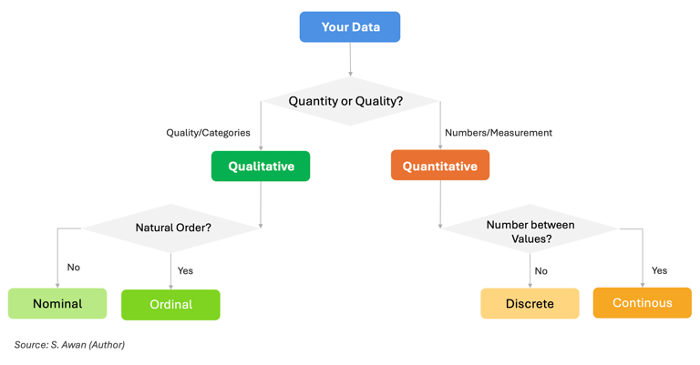
Step 1: Is this a quality or quantity?
Text labels → Qualitative
Numbers/measurements → Quantitative
Step 2: If qualitative, can categories be ranked?
No order → Nominal
Natural order → Ordinal
Step 3: If quantitative, can values fall between observed numbers?
Only specific values (counts) → Discrete
Any value possible → Continuous
When you open a CSV with 47 columns, use this decision tree:
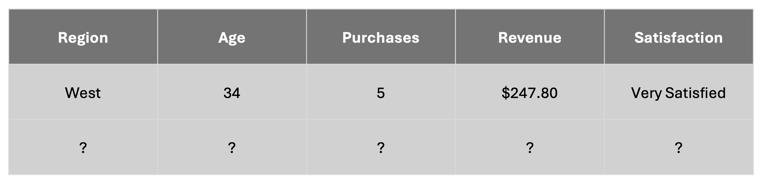
So far so good... Are you with me?
Can you identify which belongs to what?
Common Mistakes (And How to Avoid Them)

Mistake #1: Treating ordinal like interval data
Calculating mean satisfaction of 3.67 assumes equal spacing between categories. The gap between "Neutral" and "Satisfied" might not equal the gap between "Satisfied" and "Very Satisfied."
Fix: Report median and distribution instead. "Median satisfaction is 'Satisfied' with 47% rating us Satisfied or higher."
Mistake #2: Using the wrong chart
Creating a histogram for categorical data or a pie chart for continuous data misleads.
Fix: Match chart to data type:
Nominal/Ordinal → Bar charts
Discrete quantitative → Bar/column charts
Continuous quantitative → Histograms, line charts
Mistake #3: Calculating invalid statistics
Averaging department codes (1=Sales, 2=Marketing) produces "average department is 2.3"—meaningless.
Fix: Before calculating, ask "Does this operation make sense?" Only calculate means for interval and ratio data.
Quick Reference: What to Do With Each Type
Nominal: Count frequencies, use bar/pie charts, chi-square tests
Ordinal: Calculate median, use ordered bar charts, Spearman correlation
Discrete quantitative: Calculate mean/median/SD, bar charts, Poisson regression
Continuous quantitative: Calculate mean/median/SD, histograms, Pearson correlation, linear regression
Key Takeaways
Understanding data types transforms you from following recipes to knowing why specific analyses work. Data type determines valid operations—you can't meaningfully average categories or correlate nominal variables. The framework is simpler than it seems: three binary questions classify everything you'll encounter.
Misclassification cascades into bad decisions. When you treat survey responses as interval measurements, you might make strategic choices based on meaningless decimal differences. Getting data types right prevents these errors.
Real mastery comes from practice. The next time you open a dataset, spend five minutes classifying each variable before analyzing.
Ask: What operations make sense here? That deliberate practice builds career-long intuition.
Next Steps:
Practice with real data: Download any public dataset and classify every variable before analyzing.
Build your foundation: Next, learn how to visualize different data types appropriately and choose the right statistical tests based on your data structure.
About Author:
I'm a data analytics consultant aiming to impart knowledge for to-be-professionals who aim to build practical statistical and data analytical skills. After seeing the same fundamental mistakes by students, I started this blog to teach concepts that actually matter in real work. Connect with me on LinkedIn or explore more beginner-friendly guides here.